Kahn Without Kahn
by Witold | Aug 23, 2012 | Architects
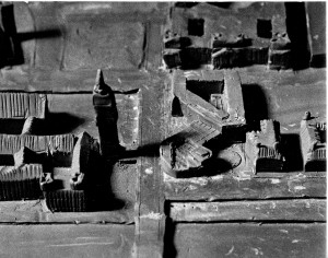
The FDR Memorial on Roosevelt Island is nearing completion. I am of two minds about this undertaking, which is based on the design that Louis Kahn was working on when he died in March 1974. It was, literally, his last project. There are so precious few Kahn works, that who could object to one more? But as David De Long, who co-curated the major 1991 exhibition on Kahn observes, “Posthumous realizations are always very, very risky.” They are particularly risky in the case of Kahn, who was famous for making last-minute changes, often after construction had started—to the consternation of his office staff, not to mention clients. So although the current project is based on construction drawings that had been prepared by Kahn’s office, these should not necessarily be considered as definitive. Even great artists have second thoughts. When Henry Bacon and Daniel Chester French were working on the Lincoln Memorial, and the building was largely completed, they had a plaster replica of the projected statue erected inside the building to study its scale, and decided it was too small and needed to be enlarged. The bronze head of the President recently installed in the FDR Memorial looks to me as if it were trapped in a vice. Who is to say that Kahn would not have refined the memorial design, in small ways and large, had he been alive to do so? We will never know.
![105[1]](https://www.witoldrybczynski.com/wp-content/uploads/2012/08/1051-234x300.jpg)
The Royal Business
by Witold | Aug 20, 2012 | Architects, Architecture, Housing
My friend Marc Appleton recently recommended a book by Royal Barry Wills. Wills (1895-1962), a Massachusetts native, was an architect (though his MIT degree was in engineering) who in the 1930s popularized the Cape Cod cottage and was a well-known residential designer. In 1938, LIFE magazine invited several architects to design modern and traditional houses; actual families would then chose one to build. Wills prevailed over no less than Frank Lloyd Wright. Wills’s book is the long out-of-print This Business of Architecture, originally published in 1941. It contains chapters titled “Stalking and Capturing of Clients” and “Design Within the Owner’s Budget.” The book is illustrated with Wills’s delightful drawings, and the tone is sensible, down-to-earth, and slightly sardonic. More than seventy years old, the book still rewards close reading and I would recommend it to any budding practitioner. Incidentally, Wills practiced what he preached; his firm, established in 1925, is still in business.
The Rude Building
by Witold | Aug 16, 2012 | Architects, Architecture, Urbanism
From the Plus Ca Change Desk.
Have people read A. Trystan Edwards? Edwards (1884-1973) was a Welsh architect and town planner who studied at Liverpool, and articled under Sir Reginald Bloomfield. In 1924 he published an extraordinary book, Good and Bad Manners in Architecture that discusses many of the issues currently raised by the current New Urbanism movement. You can get an idea of the book from the frontis page: “This book asks the novel question, How do buildings behave towards one another? It contrasts the selfish building, the presumptuous building and the rude building with the POLITE and SOCIABLE building; and it invites the public to act as arbiter upon their conflicting claims.” The “rude building” is very good. There should be an annual prize for the Rude Building of the Year. Edwards also wrote Architectural Style, which is likewise worth reading. Both are out of print, so either a good library or AbeBooks.
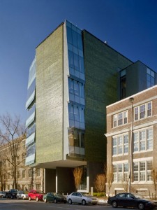
Skirkanich Hall, University of Pennsylvania (Williams & Tsien, architects)
The Taxi Index
by Witold | Aug 5, 2012 | Architecture
There are so many indices for measuring urban success: creative jobs, low crime rates, low pollution, walkability, high education levels, happiness quotients. I would add another. Returning to Philadelphia from a trip last week I took a taxi. I sat in a beat-up car, squashed into the back seat by a crudely made security barrier plastered with scratched up decals, no air-conditioning, and to add insult to injury, the reckless driver didn’t even know the city. I had just come from LA where all the taxis I took were new Prius’s, picked me up on time, and the drivers seemed to know there way around. New York taxis are pretty good, especially the minivans, and they have useful video screens. The city will soon be getting a new Nissan taxi. OK, it’s not as good as the late lamented Checker, but it’s something. Of course the gold standard for taxis is the London black cab, well-designed, diesel-powered, roomy (it can carry 6-7 people), and driven by knowledgeable navigators. And London is a pretty successful city, too.
Round and Round
by Witold | Jul 28, 2012 | Architecture
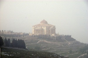
Palladio’s Villa Rotonda has provided inspiration for architects over the ages, starting with Vincenzo Scamozzi, Palladio’s student who completed the Villa Rotonda after his master’s death. Scamozzi built La Rocca, a hilltop villa in nearby Lonigo. Inigo Jones designed several bi-axial houses, but never found a client. In the eighteenth century, there were at least four British Rotondas, the most celebrated being Lord Burlington’s Chiswick House. There are a number of more recent examples; I have seen a house inspired by Rotonda on the outskirts of Pittsburgh, designed by Alvin Holm, and there is a small version, the Henbury Rotonda, by Julian Bicknell, in Cheshire, England. Although neither is more faithful to the original than the replica built in Nablus, on the West Bank. The house belongs to Munib al-Masri, a petroleum services magnate. Another Rotonda-like house, Crystal, belonged to Onslow Roper, a fictional arms dealer in John Le Carre’s The Night Manager.
Crying Wolf
by Witold | Jul 26, 2012 | Architecture, Modern life
I visited a house by a famous architect (he’s a friend, so let’s just call him The Architect). The house was beautiful, thoughtfully designed and exquisitely executed. Very low key, suiting its rural site. Minimalist, in a luxurious sort of way. And big. The occupants were a retired couple, with grown-up children long since moved away, but their home was the size of a small primary school. The main corridor was a hundred and fifty feet long, and the house didn’t end here, there were still garages and outbuildings.

There have been wonderful houses in the past, even the recent past, but most of the ones I see today feel over-done. Too much money thrown at too simple a problem. I can still get weak-kneed over the Maison de Verre, Fallingwater, or a Palladio villa, but most modern houses feel like a Wolf cooking stove; impressive, perfectly detailed, obviously expensive, but it’s still just a stove.
City Limits
by Witold | Jul 22, 2012 | Urbanism
There are different arguments to be made about raising the height limit on buildings in the District of Columbia, but both Representative Darrell Issa and New York Times reporter Rebecca Berg are mistaken when they describe the original decision to set height limits as “arbitrary.” Before the Building Heights Act of 1899 was passed, Congress sent a commission to Europe to study height limits in cities such as London (80 feet), and Paris, Berlin, and Vienna (64 feet), and to also look at American cities, most of which had height limits (New York and Philadelphia were two exceptions). The commission settled on a height limit that followed a well-established urban design precedent, that is, the height of buildings should be related to the width of the street on which they stand. In Washington’s case, buildings on streets could be 90 feet high, while those on the broader avenues could be 110 feet. Hardly arbitrary.
Zigzag
by Witold | Jul 15, 2012 | Architecture
I’ve always wondered where the continuous zigzag form came from (it has no name). Rem Koolhaas used something like it on the Educatorium, where a line suggested—improbably—that the roof and the floor were actually the same surface, just bent. Since then the ZZ Shape has proliferated, mostly on fashionable façades. Diller Scofidio + Renfro used it on the ICA in Boston, and in their proposed Eyebeam Museum in New York.
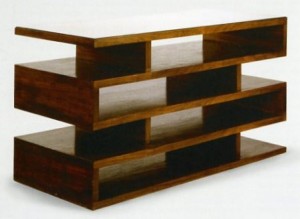
I came across the Ur-ZZ the other day. In 1923, Walter Gropius designed a pair of newspaper stands as part of his office redo in the WeimarBauhaus. Made of mahogany veneer on plywood, the stand is surprisingly formal for an avowed functionalist. The broad unencumbered surfaces sort of make sense for its use. But in a building it strikes me as an affectation that has no structural logic. But then, much recent architecture seems more like furniture than buildings.
Taken by Modernity
by Witold | Jul 9, 2012 | Architecture, Design
In 1971 I entered a competition for an addition to the British Houses of Parliament. My design blended Aalto with Le Corbusier—my two heroes. In hindsight, the large complicated project was far beyond my pay grade, but I was ambitious. Still, whatever in the world made me decide to do all the area calculations for the complicated building on an abacus? Cheap pocket calculators did not become popular until the mid 1970s, but still! I didn’t win the competition, but I still have the abacus. I remember the pleasant clickety-click of the wooden beads. I’ve never had such a fond memory of a pocket calculator.
I thought of my abacus when I read my friend Andres Duany’s recollections of student life at the Ecole des Beaux-Arts in Paris (in 1970-71). His essay is in Windsor Forum on Design Education. The writing is a witty, sardonic, perceptive (vintage Duany) take on architectural education. He describes the atelier, where shared drafting tables were regularly dismantled and assembled as needed.
“Needless to say there were no attached parallel rulers, only T-squares. Remember the thrill of walking around the streets carrying that incredibly charismatic instrument! And the pleasure of the visceral click as the T-square was snapped into orthogonal alignment before every line was drawn. And twirling and slapping down triangle and scale. And the ritual of systematic dismantling and cleaning the Rapidograph ink pens before final drawings, like soldiers checking their equipment before the assault. How much more satisfying than the effeminate typing on a keyboard, the sleazy sliding of the mouse followed by the infantile, gurgling and cooing of the computer! Forgive the nostalgia, but I am gripped by what has been taken from us by modernity!”
Amen.
Potemkin Village
by Witold | Jul 4, 2012 | Housing
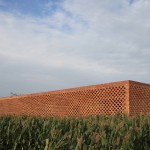
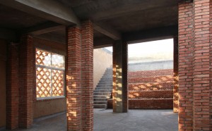
This is the definitely the year of the Chinese architect. Wang Shu wins the Pritzker Prize, the dissident Ai Weiwei’s takes part in the design with Herzog & de Meuron of this year’s Serpentine Pavilion (which Paul Goldberger tweeted is “thoughtful, pleasant, hardly anyone’s greatest moment”), and now the British magazine, Architectural Review, presents its 2012 House Award to John Lin, an assistant professor at the University of Hong Kong and a principal in the firm Rural Urban Framework. The house is surrounded by a perforated brick screen. Behind the screen, four courtyards accommodate family activities, animals, and a biogas digester. The magazine press release calls it “a modern prototype of this traditional locus of rural life.” Well, it’s certainly uncompromisingly modern, but I worry that it looks so neat and designy. Trying to imagine it with muddy pigs.
THE LATEST

Coming October 8
