HOME ECONOMICS
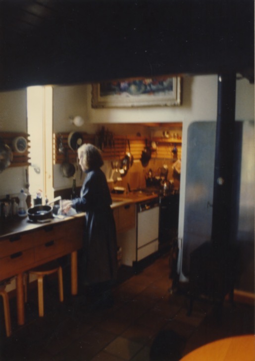
I recently reviewed an upcoming book about home economics by Anna Myjak-Pycia, Another Modernism. Home economics is often derided as having been too traditional, to much a celebration of homebound femininity, yet it had a lasting influence on the way that we live—and especially work—in our homes. I wrote about the work of Ellen Richards, Christine Frederick, and Lillian Gilbreth, self-styled “domestic engineers,” in Home, and I took it to heart when, shortly after, my wife and I built our own home, the Boathouse (see The Most Beautiful House in the World), Shirley was small (in stature not presence) and I am tall, and the kitchen suited us both. There were no cabinets. A long wooden rack served the same function as the pegboard in Julia Childs’s kichen, a place to hang utensils, knives, pots and pans, a scale, a clock, etc. All other storage was in drawers, some as deep as file drawers, that were below the counter but not all the way down to the floor. Dishes and glasses were in a nearby freestanding cupboard. We finished the top of the counter, which was built by my friend Jean-Louis Bévière,

FROM OUR FOREIGN DESK
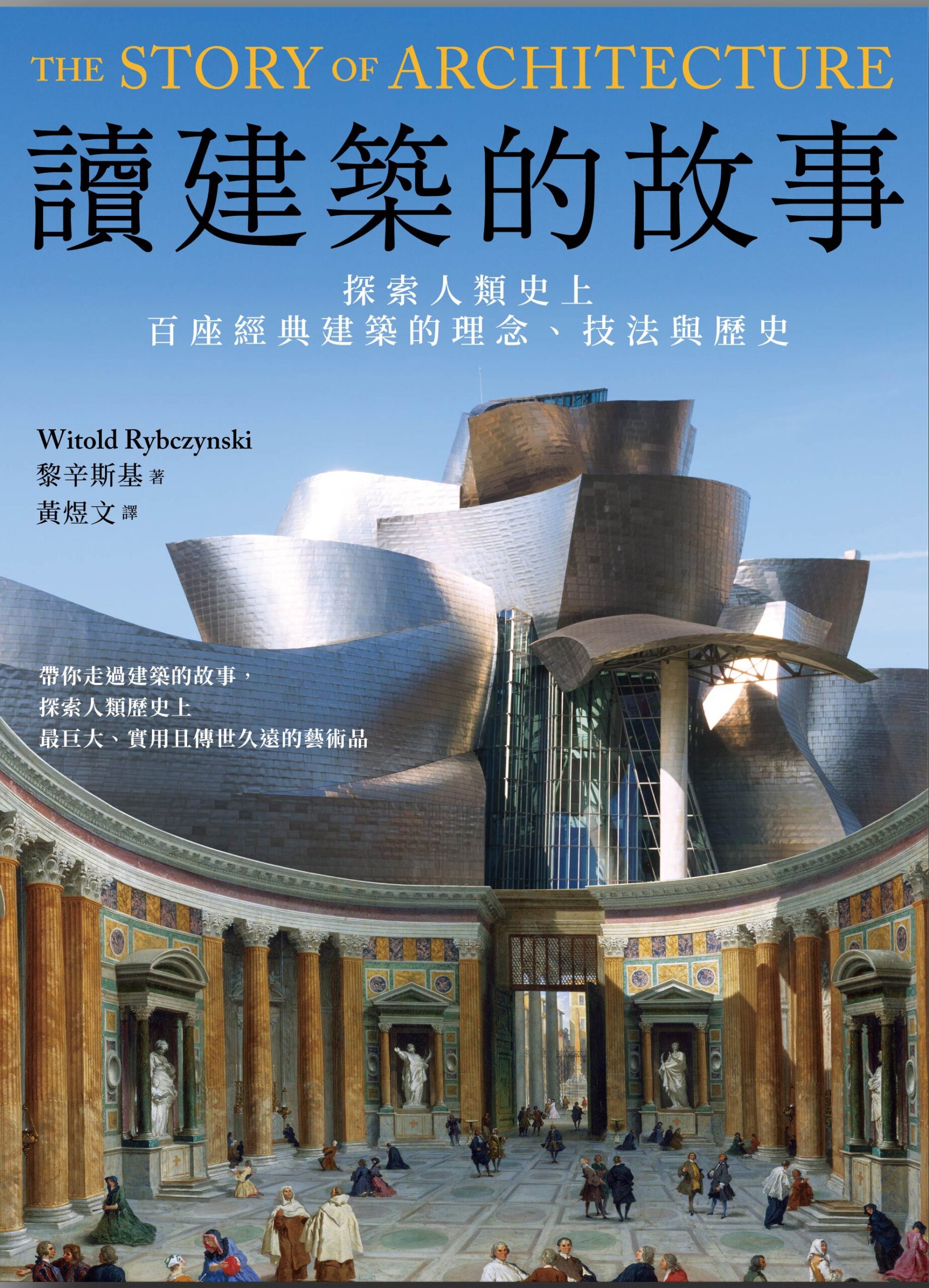
Coming soon from Owl Publishing House in Taipei, Taiwan, a translation of The Story Of Architecture and The Driving Machine. Owl has previously published Now I Sit Me Down to Eat, How Architecture Works, Makeshift Metropolis, One Good Turn, Waiting for the Weekend, and Home.

DO-IT-YOURSELF
“Man Builds House with STONES and LOGS in the Forest.” YouTube is full of bright ideas for building your own house: in a dome, underground, out of ferrocement, or bales of hay, or logs, We promise it will be cheaper, easier, faster. My advice is keep it simple, avoid shortcuts; the old solutions are best, especially for beginners. Building your own home, I mean really building it, without an architect or a contractor, can be stressful. The level of stress will be increased, needlessly in my opinion, by two things.
First, trying to do too much. I remember once visiting a couple who were building their own home. They showed me their plans for a Quebecois-style house, two stories with the typical bell-cast roof. Very large, very ambitious. In the meantime they were living in what would eventually be their two-car garage, a straightforward structure that they had converted into a temporary home. It was snug and cozy, and had the charm of a place that was improvised rather than designed. Shirley and I had just finished building our house (picture above), which was not much bigger than this garage. I remember thinking to myself that they should forget about the big house,

CLICK, CLICK, CLICK
My first computer, we’re talking 1983, was an Osborne 1. It was billed as a portable, in the sense that it was designed to take a beating, and you could carry it around—well, not far, it was the size of a sewing machine and weighed twenty-five pounds. It had two drives for floppy discs and a monochrome screen that was smaller than a postcard. No battery and no fan. The design had a no-nonsense military feel, like an Army jeep. On top of that the $1,795 price included bundled software: CP/M, WordStar, and SuperCalc. But what I liked most about it was the full-size keyboard, which doubled as a lid: it had contoured keys that had a tactile feel and an audible click, as well as a proper numeric keypad. The design was obviously patterned on an IBM Selectric typewriter, which was also the model for the IBM PC, that appeared the same year as the Osborne (1981). I’ve never had a keyboard that I enjoyed as much, except for the IBM Thinkpad G40 that I owned two decades later. These days I write on a MacBook Air. It has all sorts of advantages that Adam Osborne never dreamed of,
THE NEW YORK POST RECOMMENDS
On a list of the “best books to gift to the readers in your life this Christmas,” the New York Post includes The Driving Machine which shares a spot among the nonfiction picks with Erik Larson and Malcolm Gladwell. “Acclaimed design writer Rybczynski traces the evolution of automobile, from Carl Benz’s three-wheel motorcar in 1885 to modern EVs. On the journey, he stops to focus on various icons, such as Ford’s Model T, the VW bus, the Mini Cooper and even, gasp, a Chrysler minivan.”

SLUM CADILLACS
Back in 1978 I took part in Stewart Brand’s Whole Earth Jamboree. The deal was you could speak about any subject you wanted, but for no more than 5 minutes. Here is what I said.
I’d like to talk to you today about slum Cadillacs and technological incongruity. In the 50s it was quite fashionable to study slums and the people who lived in them. One of the startling facts that came out of those studies was that a lot of poor people drive Cadillacs. What’s interesting is the kind of reaction that people gave to this fact. Some people were upset because they had Cadillacs and this somehow reduced their status symbol, but a lot of people were upset because they saw that this was somehow inefficient, and in some vague way, immoral.
This kind of philosophy has colored American thinking about technology for some time and that is that technological development must be congruent, everything has to move across the board on a step-by-step basis. According to this thinking, a poor person should drive a poor car. And a poor person driving an expensive car has this touch of immorality. I think that this is not a useful type of philosophy to have,

