MUDDLING THROUGH

LTIJust returned from a brief visit to the UK. When you arrive in London, if you have £20 you can take the Heathrow Express (travel time 15 minutes) to the city; if you have £28 you can go first class. The spiffy train interior makes Acela look frumpy. When did the British get so good at design? The original London black cab was the Austin FX3, introduced in 1948. It had plenty of room for luggage, flip-down jump seats, and rear-hinged doors for the benefit of the passengers. The latest model of black cab, TX4,

Read more

NEWS DUMP

pressThe opening credits of Billy Wilder’s 1974 filmed version of The Front Page portray the short, inglorious life of a daily newspaper, from typesetting and printing to being distributed and read. The final frame shows the front page being used to line the bottom of a birdcage; catching bird droppings is all that old news is good for. Today, no news seems to be too old, at least not on the New York Times website. The pleasure of opening a daily newspaper is its freshness, not only the crisp newsprint, but the news itself.

Read more

TV ASIDE

kevin-spacey-house-of-cards-9It’s not often that politicians have anything penetrating to say about architecture. Even fictional politicians. Especially villainous fictional politicians. Kevin Spacey’s Rep. Francis Underwood, in Netflix’s House of Cards delivers this memorable aperçu: “Money is the McMansion in Sarasota that starts falling apart after ten years; power is the old stone building that stands for centuries.”

Read more

CORPORATE HOMES

In the midst of the astonishing sale of the Washington Post to Jeff Bezos, a related announcement has received less attention: the newspaper will be getting a new home. Developers have been invited to make proposals, and while the final choice has not yet been made (and given the sale of the paper, who knows?), some of the alternatives have been made public. The architects include the usual megafirm suspects, and the designs are equally predictable–buildings for anybody, anyplace. What a difference when the Chicago Tribune held a well-publicized architectural competition in the 1920s for its home,

Read more

THE AMERICAN SYSTEM

The protagonist of Ward Just’s latest novel, Rodin’s Debutante, makes a pronouncement that drew me up short, it is such a pithy and accurate description of the American polity.

“I think at a very early age I understood the American system, the country so various, so large and unruly, poised to fly apart at any moment. The system was founded on compromise and reconciliation, an infinity of checks and balances but always the willingness to look the other way until the world forced closed focus.”

Read more

SAVE THE STACKS

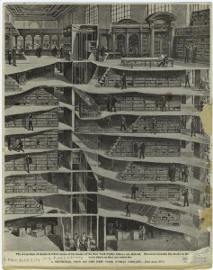
nyplI am lending my voice to those who are calling for a reconsideration of the plan to demolish the stacks beneath the Reading Room of the New York Public Library. While it is true that these stacks are not generally open to the public, they are an integral part of this extraordinary building, a Beaux-Arts design but truly a machine for reading in. As a writer and researcher, libraries–especially public libraries–remain for me special places. Library stacks, even more than reading rooms, are their symbolic heart. I think that one of the things that drew me to writing was the experience of wandering the stacks of McGill’s old Redpath Library,

Read more

Sant Francesc

formentera


I took this photo in the spring of 1967, in the village of San Francisco on the Balearic island of Formentera where I was living at the time. The wall in the background is the church of Sant Francesc Xavier, an eighteenth century building, fortified against attacks by the Barbary pirates who periodically descended on the island. The mesh above the court must be there to keep the soccer ball in bounds. I assume that the taller figure is that of the local priest, or brother, acting as a referee, as he is the only one wearing street shoes.

Read more

GOD’S HOUSE

In an article in the current issue of Design Intelligence, the architect and Notre Dame professor, Duncan G. Stroik writes that the design of contemporary  megachurches, which he characterizes as “non-architecture,” leaves much to be desired. It’s hard to argue with that (see my Slate slide show on megachurches here). But then Stroik goes on to equate megachurches with modernism, whence he elides into the classicist’s standard litany of the failings of modernist architecture. “Gone was the need for human scale and proportions, natural materials, historical elements, and the classical understanding of civic order,” he writes.

Read more