STACKED

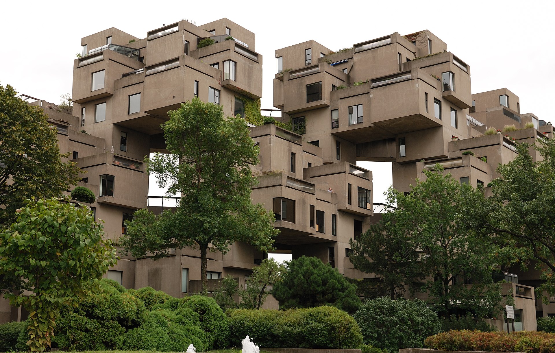
Duo Dickinson seems to have discovered the stacked box fad in a recent post on Common\Edge. Well, duh. In April 2009 I wrote a Slate column about “The Jenga Effect.” It was prompted by 56 Leonard Street, a New York apartment building designed by Herzog & De Meuron. Of course, what looked like a pile of stacked boxes was actually a conventional high-rise with cantilevers and setbacks. I think what attracted architects to stacking was the appearance of shakiness; architects in the past had always aimed at solidity, so why not go the other way?

Read more

FRESHENING UP THE PAST

The Sainsbury Wing of London’s National Gallery is an example of postmodernism, a style that was already in decline when Robert Venturi and Denise Scott Brown won a controversial competition to build this addition. In the eyes of many, including this writer, the Sainsbury Wing, like James Stirling’s Neue Staatsgalerie in Stuttgart, is one of the (rare?) paragons of postmodernism. So it was with dismay that I read the headline in Dezeen: “Sainsbury Wing Revamp Approved.” Revamp? Although the Sainsbury Wing is a Grade I-listed building, it apparently needs freshening up. The freshening up includes removing some of the non-structural columns in the lobby as well as carving a large Trump-like sign into the Portland stone facade.

Read more

SHEDS

Architecture mags these days cover a variety of topics—sustainable building materials, energy conservation, social equity; it seems that they have decided that building rather than architecture is their domain. But building and architecture are not the same. Nikolaus Pevsner’s  introduction to his 1945 classic Outline of European Architecture began with this statement: “A bicycle shed is a building; Lincoln Cathedral is a piece of architecture.” In my beat-up paperback copy, purchased when I was a student, I underlined the sentence and pencilled a question mark in  the margin. In those halcyon days I had a youthful reaction to Pevsner’s provocation;

Read more

THIS IS THE PLACE

Architects and town planners often refer to a “sense of place” as a mark of authenticity. For example, Central Park has a sense of place, but a Walmart parking lot doesn’t. Nothing is as bad as placelessness—the term “placeless sprawl” appears in the first sentence of the Charter of the New Urbanism. It sounds like a logical extension to go from valuing a “sense of place” to “place-making.” But I’m not so sure. When Brigham Young arrived at Salt Lake Valley he is said to have exclaimed, “This is the place!” Young had the benefit of a previous celestial vision.

Read more

READ ALL ABOUT IT

I came across this confident statement in the September issue of New York Review of Architecture, in a rather breathless review of a recent book about Aline and Eero Saarinen: “It is through media, of course, that we primarily consume architecture.” I was brought up short. How preposterous, I said to myself. But on second thought I realized that it was all too true. If there is an audience for architecture—and judging from the almost total absence of architecture columns in the mainstream press one has to be doubtful—it’s likely that its chief connection with architecture is through media rather than first-hand experience.

Read more

PHILADELPHIA SECESSION

The other day, my friend Jonathan Barnett and I were walking down 23rd Street when our attention was drawn to an unusual building on Manning Street, one of those narrow alleys that are common in Philadelphia. Obviously very new, the building caught our eye for a number of reasons. First, the walls were brick, at a time when virtually all infill housing in the city is glass with perhaps a scattering of metal siding. And this brick was not the usual red, but lightly glazed yellow. Second, the regular composition of rectangular openings punched in the facade of this three-story box was similarly unusual at a time when architects are bending over backward to avoid regularity,

Read more

NIGHT

Love has gone and left me and the days are
all alike;
Eat I must, and sleep I will,–and would that
night were here!

–Edna St.Vincent Millay

Read more

REVIVALS VS. TRANSPLANTS

Revivalism in architecture refers to a style that consciously echoes or evokes the style of a previous era. This blurs an important distinction. The Italian Renaissance and the British Gothic Revival were echoing the styles of earlier eras, earlier local eras. The Greek Revival, on the other hand, whether it occurred in Berlin, Edinburgh, or Philadelphia, was a foreign style from far away; it was a transplant. That did not mean that it was less authentic, but it did give it a different meaning. When Robert A. M. Stern built Franklin and Murray colleges at Yale in 2017, he was reviving James Gamble Rogers’s Collegiate Gothic of the previous century. But Rogers had not revived a local tradition; his inspiration was a collection of postcards and photographs of Oxbridge colleges (that he had not visited). He was transplanting.