Corridors

Jon Gertner writes an interesting article in the February 25 New York Times on technological innovation. It is illustrated by a 1966 photograph of researchers standing outside their offices in the Bell Lab building in Murray Hill, N.J. An endless, featureless, rather wide corridor with a strip of fluorescent lighting straight down the center of an acoustic tile ceiling. A model of dreary, unimaginative, bureaucratic design, right? Wrong. As Gertner writes, the building was conceived by Mervin Kelly (who later became Bell Labs’ chairman of the board) in 1941, and the long corridor,

Read more

Dress Code

I finally had a chance to see the modifications that Diller Scofidio + Renfro have made to Lincoln Center. These changes were much ballyhooed by the New York press, but they strike me as self-conscious one-liners, calculated to draw attention to themselves. Like a Hollywood star who dresses for the Oscars in a tuxedo and colorful sneakers. The, perhaps unintended, and surprising consequence at Lincoln Center is that the 1960s buildings actually look like coherent works of architecture by comparison with what come across as art installations.


Read more

Corbu in Chelsea

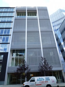
524 West 19th Street in New York’s Chelsea District is a small residential building designed by Shigeru Ban, with Dean Maltz. The 11-story block contains only 8 units which the developer calls “houses,” since they are two-story duplexes that extend through the building, front-to-back, recalling the units in Le Corbusier’s unité d’habitation in Marseilles. The Chelsea houses have two-story living rooms, too, and shallow loggias. There the resemblance ends, since these are expensive ($3.6 – $11.25 million) condominiums with Corian kitchen islands and Miele cook tops. Press a button and the entire motorized 20-foot glass wall,

Read more

Hotel Rooms

I have stayed in some memorable hotels—Brown’s in London, and Cipriani’s in Asolo—but for some reason the hotel rooms I remember best are the ones that were, let us say, sub par. My most memorable hotel experience was in a small town whose name I forget, on the shore of Lake Atitlán in Guatemala. I was visiting a rural development project  in a nearby village. It was the late 1970s, some years before the military coup that devastated this small nation, and while the city was awash in young soldiers, the countryside was quiet. My wife and I checked into a hotel that was like something out of a B.

Read more

Nude Pei

I. M. Pei’s East Building of the National Gallery of Art in Washington, D.C. is currently undergoing repairs. The cladding of the 33-year-old building is being entirely re-hung to rectify a problem with the anchors that support the marble slabs, a project that is expected to take four years and cost an astounding $85 million. It’s worth taking a look at Pei’s denuded building. The familiar triangular prisms turn out to be concrete frames in-filled with brick, quite unlike the effete geometry that we are used to. It is as if a businessman removed his pin-striped suit to reveal a muscle shirt.

Read more

Learning to Design

In a filmed interview, Denise Scott Brown observed that learning to design was similar to learning how to ride a bicycle—you got on, fell off, got back on, and by the end of the day you were riding. The implication is that design—like bicycle riding—can be learned, but it cannot be taught. Allan Greenberg made much the same point to me in a recent conversation. If law was taught like architecture, he said, law students would spend all their time in moot court, but moot court actually plays a very small role in a legal education. Many accomplished architects did not attend an architecture school—Edwin Lutyens,

Read more

The Third Client

An interesting comment by Jaquelin Robertson who was on a panel at the recent “Reconsidering Postmodernism” conference in New York. He observed that an architect has three clients. There is, obviously, the real client who is paying for the building. The second is the client inside you, the one who says “I want this, let’s do that.” According to Robertson this is a client you shouldn’t listen to. The third client is a person whom you’ve never met. Years from now, someone walks by the building and thinks, “How nice. Someone actually thought of that.” In a conversation later, Jaq pointed out to me that the real reason the old are revered in China is not that they are wiser,

Read more

Jazz on Trafalgar Square

It’s exactly twenty years since Venturi Scott Brown completed the Sainsbury Wing of the National Gallery in London. After visiting the museum last weekend, I am still impressed. The sheen of newness is gone now, and the architects’ intentions are all the more visible: to make an addition that continues the 1830s building, and is also itself. Venturi explains that the rhythm of the pilasters on the façade is meant to be a jazzy riff on Wilkins’s staid minuet. The sometimes arch mannerist gestures seem a little tired, but the resolute attention to detail and construction (so rare today) remains affecting,

Read more