CREAM RISES

keep_calm_and_use_your_t_square_sticker-rdf59da2584e348b78f40f89c4a5cf004_v9waf_8byvr_512A friend who is a composer and musician, wrote to me recently after reading my essay on parametric design in Architect. “What I found surprising is that in the Sixties music was going through much the same thing,” he wrote. “Composers dealt only in parameters, and arranged them according to Set Theory. Milton Babbitt, who had a degree in math before concentrating on music, held forth at Princeton about the use of the Set, as derived from Schoenberg’s twelve-tone theory. Alan Forte at Yale wrote a book called Set Theory,

Read more

TOO MANY WORDS

KrierI was listening to a lecture on YouTube by Léon Krier. He was in full apocalyptic mode, his rousing talk illustrated by his charming but barbed drawings. At one point he recounted a quotation: “I wish I could speak a language where no word is repeated.” Krier couldn’t remember the source–it sounds like Marcel Duchamp or Max Ernst to me. In any case, Krier’s point was that this could serve as a maxim for today’s modernist architects, who judge themselves–and are judged–almost solely on their originality. What makes the metaphor so cutting is that a language of unrepeated words would be simply meaningless gobbledygook,

Read more

FANTASY FACTORIES

Dream_Castle_by_SukhRiarOliver Wainwright writes an excellent article on architectural education in The Guardian. He is particularly good describing the distortions that have accumulated in the so-called academy. Here are some highlights:

Wiry contraptions hang from the ceiling, while globular fungal forms nestle on tables between the spidery legs of 3D-printed creatures. A post-apocalyptic confetti of scalpel blades, empty Pot Noodles and cans of Coke is scattered among this landscape of foreign objects, while a sleeping bag pokes out from under a desk – perhaps with someone still in it.

_____________________________

Attending final presentations as an external critic,

Read more

SAVE THE STACKS

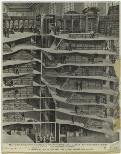
nyplI am lending my voice to those who are calling for a reconsideration of the plan to demolish the stacks beneath the Reading Room of the New York Public Library. While it is true that these stacks are not generally open to the public, they are an integral part of this extraordinary building, a Beaux-Arts design but truly a machine for reading in. As a writer and researcher, libraries–especially public libraries–remain for me special places. Library stacks, even more than reading rooms, are their symbolic heart. I think that one of the things that drew me to writing was the experience of wandering the stacks of McGill’s old Redpath Library,

Read more

THE OTHER STYLE

The first international style in architecture was not the white-box style of Le Corbusier and Walter Gropius but Art Nouveau, modernism’s predecessor and in many ways its aesthetic and philosophical opposite. Art Nouveau flourished from 1890 to 1910, and along the way it produced a surprisingly large number of masters: Gaudí, Hoffmann, Horta, Mackintosh, Plečnik, Sullivan, Van de Velde, and Wagner. And that’s just the leading architects; there were also painters, designers and craftsmen: Beardsley, Klimt, Lalique, Moser, Tiffany. Thirty years is a good long run as architectural fashions go, indeed, the International Style lasted barely that long, nevertheless, modernist apologists have always pooh-poohed Art Nouveau,

Read more

Sant Francesc

formentera


I took this photo in the spring of 1967, in the village of San Francisco on the Balearic island of Formentera where I was living at the time. The wall in the background is the church of Sant Francesc Xavier, an eighteenth century building, fortified against attacks by the Barbary pirates who periodically descended on the island. The mesh above the court must be there to keep the soccer ball in bounds. I assume that the taller figure is that of the local priest, or brother, acting as a referee, as he is the only one wearing street shoes.

Read more

GOD’S HOUSE

In an article in the current issue of Design Intelligence, the architect and Notre Dame professor, Duncan G. Stroik writes that the design of contemporary  megachurches, which he characterizes as “non-architecture,” leaves much to be desired. It’s hard to argue with that (see my Slate slide show on megachurches here). But then Stroik goes on to equate megachurches with modernism, whence he elides into the classicist’s standard litany of the failings of modernist architecture. “Gone was the need for human scale and proportions, natural materials, historical elements, and the classical understanding of civic order,” he writes.

Read more

I AM A MEMORIAL

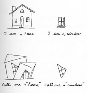
VenturiThe book launch of Civic Art, a history of the first hundred years of the U.S. Commission of Fine Arts, was the occasion for the Charles Atherton Memorial Lecture at the National Building Museum, delivered this year by Thomas Luebke, the current secretary of the commission. In the course of his talk, Luebke made an interesting observation: commemorative memorials in Washington, D.C. have become increasingly influenced by other media, specifically photography. When the Lincoln Memorial was completed in 1922, Daniel Chester French’s statue of the president was the sculptor’s interpretation of his subject (French did have access to a life mask of Lincoln,

Read more