VISUAL POLLUTION

I came across an online lecture at a design conference by the British product designer Jasper Morrison recently, and I was struck by one of his statements. “As designers, we are responsible for our environment, and filling it with amazing shapes and forms and surprising expressions of our genius, doesn’t make a very good atmosphere. In fact, to me it’s becoming a kind of visual pollution.” Morrison was talking about housewares, appliances and chairs, but he could have been describing buildings. The pressure on architects to produce new and exciting forms that will attract the attention of the media has had a distorting and negative effect on the field—visual pollution,

Read more

SHORT LIFE

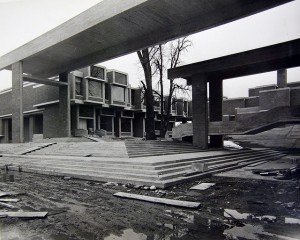
I read an amazing (for me) fact recently. A participant in a Getty Center colloquium on building preservation casually observed that the life cycle of conventionally built (masonry and wood) buildings is about 120 years (before major repairs), whereas for modernist buildings it is only half that time—sixty years. Consider Yale’s masterpieces of the 1960s: Louis Kahn’s art gallery, Paul Rudolph’s A & A, Eero Saarinen’s colleges. They have all recently undergone major renovation, at a cost far exceeding the original construction cost. In the words of  Yale dean, Robert A. M. Stern, “They cost pennies to build and millions to renovate.”

Sixty years!

Read more

TOO MANY COOKS

NEW-PANORAMIC-Glen-blue-sky-1024x585The current copy of my alumni magazine, McGill News, contains an article on the university’s new health center, a 2.5 million square-foot behemoth that consolidates no less than four existing health facilities. It’s hard to characterize this building, other than to say that it is big. The article does not identify the architect. Perhaps because this particular broth had so many cooks. The health center was built by a public-private partnership, that is, the building was designed, built, and financed by a private consortium, a process increasingly popular for public as well as private buildings.

Read more

FOLLIES


The architectural folly has a long history. James Wyatt designed Broadway Tower in the Cotswalds in 1794. While it was more or less habitable—William Morris and Edward Burne-Jones rented it as a studio for a time—it was not primarily intended to be a functional shelter. It was an architectural whimsy—and understood as such. It struck me the other day that we take our follies much too seriously. Philip Johnson’s Glass House, for example, is a stereotypical folly: impractical, unusable in extreme weather (it lacks proper ventilation and insect screens),

Read more

CATEGORY I AND CATEGORY II


You can divide residential architects into two categories: those who design for their clients, and those who design for their colleagues. When the work of Category I is published, it is in mass market magazines such as Architectural Digest and Elle Decor; the work of Category II appears in professional journals and architectural monographs. These are read by  architecture students, which may be why Category IIers tend to be invited to teach.

Read more

THE FORM TIE DETAIL

serveimage


Corbusier was the first architect to use cast-in-place concrete as exterior (and interior) cladding, probably in the Unité d’habitation (1946-62) in Marseilles. The Unité was actually hybrid construction, consisting of cast-in place and precast concrete as well as a steel frame. By the time he built the Shodhan house (1956) in Ahmedabad, he was using exposed cast-in-place concrete throughout. Concrete formwork must be designed to resist the pressure of the heavy concrete until it sets. The cheapest way to do this is to use form ties—wire ties that hold the two pieces of formwork together;

Read more

YO MAMMA

P1020218Vitruvius called architecture the mother of the arts. He meant that it encompassed the other arts—both physically, as in temple architecture, and chronologically. I  think that the maternal analogy was also meant to distance architecture from its more exuberant offspring, painting and sculpture;  “mother” implied a certain reserve and gravitas. Today, as Peter Buchanan writes in Architectural Review, the mother of the arts “has become reduced to superfluous spectacle.” A few days ago I saw Daniel Libeskind’s addition to the Royal Ontario Museum in Toronto. “The Crystal” summons up images of delicate transparency,

Read more

FOREVER YOUNG

Many critics have commented on the disconnect between the exterior and the interior of the new Whitney Museum of American Art. But only an article in the current issue of TIME (read in my doctor’s waiting room) points out the obvious connection between the Whitney and the Centre Pompidou. Over the decades, Renzo Piano has produced so many sedate, restrained and above all polite museums that it is easy to forget that his first effort was raucous, immoderate, and (urbanistically) ill-mannered. It also wasn’t really a very good museum. Piano has since learned how to design successful galleries,

Read more