TRUMPED UP
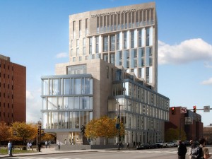
 Campus buildings, if they were Classical in style, used to display their names in Roman lettering incised into the entablature; Collegiate Gothic buildings made do with medieval script. In either case the lettering was discreetly integrated with the architecture. No more. A growing trend in university buildings, especially high-rise buildings, is to display the name at billboard scale (thank you Robert Venturi). This started with medical buildings, but I have noticed other campus buildings sprouting overblown signs (the LeBow College of Business at Drexel is illustrated here). What drives this disturbing practice which gives university buildings the appearance of motels or casinos?

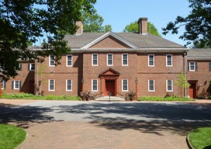
 The other day we drove to Mount Cuba, a horticultural center in Delaware. The forest garden is part of an estate built in the 1930s by Lammot du Pont Copeland and his wife Pamela, a branch of the mighty Delaware family. We went to look at the trillium garden, but I was also impressed by the house, a very large Colonial Revival mansion that was completed in 1937. The beautiful brick architecture was exquisite, simple to the point of distillation. The design was the work of Victorine and Samuel Homsey. Samuel (1904-1994), a native of Boston, graduated from MIT and met and married Victorine du Pont (1900-98),
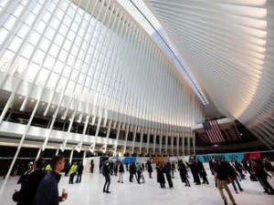
 The newly completed Oculus in Manhattan is not just misnamed (an oculus is a round opening, not a slit) it is misconceived. It is not a question of design, or execution, or cost, but rather of the entire concept. Does a daily commute really require this level of architectural rhetoric? Even if this were a substitute for Penn Station, it would be a dubious proposition. It made sense for our forbears to celebrate long distance train travel, when railroad terminals really were the “gateways to the city.” Today, that is no longer the case. Even air travel has become a mundane,