NEW BLOOD

I recently came across an article in The Architect’s Newspaper titled “The future of our profession depends on diversity.” The author argues that the architectural profession needs to take specific steps to increase diversity. “The architecture profession runs the risk of becoming irrelevant if we do not adapt and create pathways for minorities to enter and lead the profession,” he writes. Received wisdom, but is it true? Or, rather, hasn’t it always been true? When I studied architecture in the 1960s, there were no women in my class, no blacks, and no aboriginal Canadians. But we were a mixed group: five immigrants (two from Hong Kong,

Read more

RADICAL CHIC

The architecture group, Superstudio, was founded in Florence in 1966, the year I graduated from architecture school. I remember their projects from the Italian design mag Domus, which I used to leaf through in the library. I didn’t like them then and I don’t like them now. “Although Superstudio built very few actual buildings, its witty photo collages and designs, presented in exhibitions and glossy magazine spreads, opened up new possibilities for what architecture and urban planning could be,” opines a fawning article in the New York Times. The new possibilities included a nihilistic view of architecture masquerading as a fashionable left-wing critique.

Read more

YES, BUT . . .

“The test of a first-rate intelligence,” famously said F. Scott Fitzgerald, “is the ability to hold two opposed ideas in mind at the same time and still retain the ability to function.” In Philip Johnson’s New York Times obituary, Paul Goldberger described him as architecture’s “godfather, gadfly, scholar, patron, critic, curator, and cheerleader.”That is true. It is also true that although Johnson rejected Nazism after the end of the Second World War, in his younger years he attended Nazi rallies in Germany, admired Mein Kampf, and had connections to the Nazi party.

Read more

PARISIAN PUZZLE

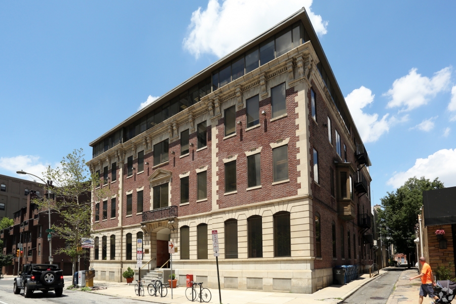
Every time I leave the Larkin Building in downtown Philadelphia, where we live, I admire the office building across the street. It’s a French Renaissance pile, three stories on top of a half basement, with an obviously more recent top floor addition. The original building, very handsome, is brick with limestone and marble trim. The raised entrance is surmounted by a wrought iron papal balcony. I’ve looked inside and there is a glass-roofed atrium in the middle. I’m impressed, but also puzzled. The building looks at least a hundred years old, and when it was built this was an industrial neighborhood with a scattering of modest Philadelphia row-houses.

Read more

CRIPES, NICK

I just learned that Nick Wilkinson (1942-2017) died. Sad news. We had lost touch in recent years but we saw a lot of each other in the 1980s. Nick founded and edited Open House International, a journal devoted to housing. He published a number of my papers as well as an issue devoted to “Seventeen Years of Minumum Cost Housing” and I was a member of the editorial board. Thanks to the British Council, Nick visited me in Montreal and lectured at McGill, and I visited him in Newcastle and lectured at the university, where he was then teaching.

Read more

THE TALENTED MR. CRET

Perhaps the most televised twentieth-century work of American architecture is the Federal Reserve headquarters (Eccles Building) in Washington, D.C., designed by Paul Philippe Cret (1876-1945) in 1938. Cret’s stripped classical facade inevitably accompanies any report on the Fed on the nightly news. Now Cret has a twofer: Walter Reed National Military Medical Center in Bethesda, where President Trump was taken for treatment of Covid-19.  Walter Reed was designed by Cret in 1939-42. It is said that President Roosevelt suggested the twenty-story tower to Cret after visiting Bertram Grosvenor Goodhue’s Nebraska State Capitol. Walter Reed is an example of Cret’s late style,

Read more

MOVING THE BOX

Blair Kamin, the architecture critic of the Chicago Tribune, recently tweeted a May 19  photograph of Mies van der Rohe’s famous Farnsworth House almost inundated by the rising waters of the nearby Fox River. Kamin writes that the water level appears to be receding, so it seems likely that the house may be spared, at least this year. Although its floor is raised five feet in the air, because Mies sited the house on low ground only 75 feet from a river that regularly overflows its banks in the spring, the house has been flooded several times,

Read more

GLASS FOLLY

Alex Beam’s interesting new book on the saga of the Farnsworth House, which I reviewed in the Wall Street Journal recently, raises an interesting question. How can a house that has so many functional drawbacks, that is basically dysfunctional, be considered a modernist masterpiece? The answer reveals more about modernism than it does about masterpieces. Modernist buildings are often described as clean and functional. Beam’s book makes clear that the glass house in Plano was neither. The glazed wall got sooty from the heating system, and was covered with condensation during cold weather. Dr. Farnsworth spent the first part of her summer weekends hosing down the exterior.

Read more