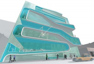
I’ve always wondered where the continuous zigzag form came from (it has no name). Rem Koolhaas used something like it on the Educatorium, where a line suggested—improbably—that the roof and the floor were actually the same surface, just bent. Since then the ZZ Shape has proliferated, mostly on fashionable façades. Diller Scofidio + Renfro used it on the ICA in Boston, and in their proposed Eyebeam Museum in New York.
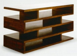
I came across the Ur-ZZ the other day. In 1923, Walter Gropius designed a pair of newspaper stands as part of his office redo in the WeimarBauhaus. Made of mahogany veneer on plywood, the stand is surprisingly formal for an avowed functionalist. The broad unencumbered surfaces sort of make sense for its use. But in a building it strikes me as an affectation that has no structural logic. But then, much recent architecture seems more like furniture than buildings.

