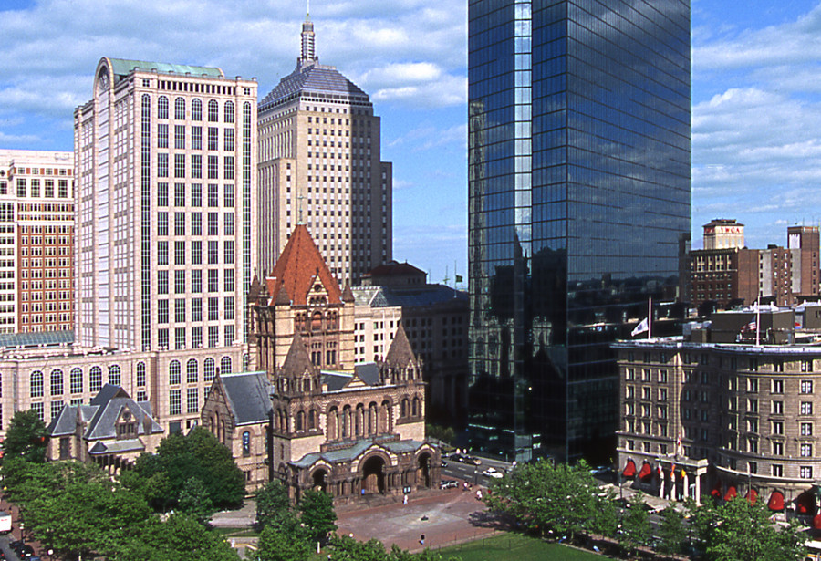
Blair Kamin, the architecture critic of the Chicago Tribune, recently made this wise observation about the latest crop of urban buildings: “Glass usually works best when it operates in counterpoint to richly articulated walls of masonry. When glass becomes the context, it often struggles to match the quality and character of limestone, granite, brick and terra cotta.” In other words, the first generation of all-glass buildings benefitted from their masonry neighbors (Pei’s John Hancock Tower, across from Richardson’s Trinity Church comes to mind). Today, not so much. Our downtowns are dominated by all-glass boxes, even cities like Washington, D.C. (once marble and limestone) and Philadelphia (once brick and limestone). Le Corbusier described (modernist) architecture as “the masterly, correct and magnificent play of volumes brought together in light.” Corbusier used glass but he never designed all-glass buildings. Neither did Mies; he added superfluous I-beams to his facades (which also had substantial spandrels). The problem with transparent glass is that it doesn’t hold a shadow, and without a shadow there can be no “play of volumes.” Since minimalist modernist architecture doesn’t offer decoration or ornament, that doesn’t leave much to look at.

Boston's Copley Square with Richardson's Trinity Church and Pei Cobb Freed's Hancock Tower

1 thought on “THE TRANSPARENCY TRAP”