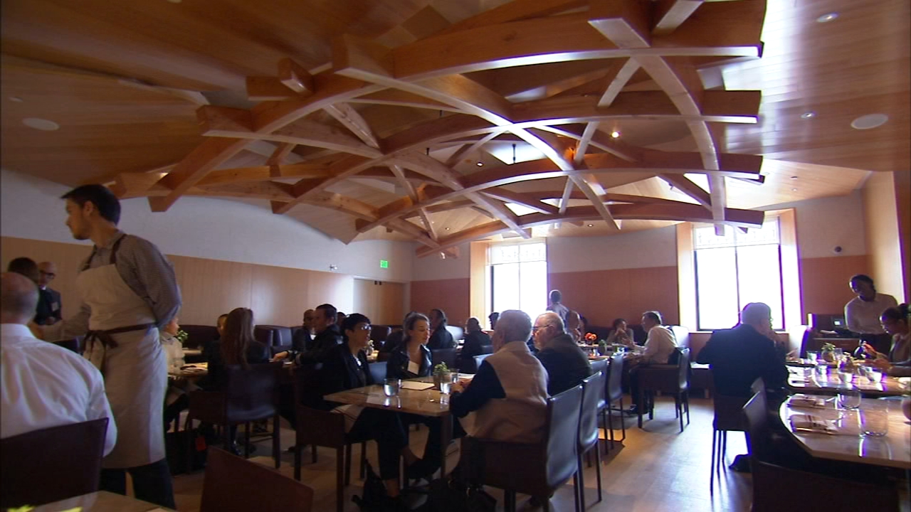
Last October the Philadelphia Museum of Art re-opened its restaurant. It is designed by Frank Gehry, whose firm is doing a major do-over of the museum. I thought I should take a look and we went there for lunch. The small (75 seats) restaurant, somewhat mysteriously titled Stir, is inauspiciously located behind a frosted glass wall off a banal corridor—hardly an elegant setting. The PMA describes the restaurant decor as having an “ebullient Gehry touch.” I suppose that is a reference to the heavy trellis made of curved laminated Douglas fir beams that is suspended in the middle of the room like some sort of woodsy Calder mobile. There is not much evidence of ebullience elsewhere. The walls and ceiling are paneled in Douglas fir plywood, the floor is red oak. Wood is generally considered to be warm, but the way Gehry handles it, without detail or indeed any sign of human craft, is curiously utilitarian, and the overall effect is more like a high-school cafeteria than a museum dining room. Incidentally, all those hard surfaces, as well as the open kitchen (I can’t wait for that fad to pass) make for a very noisy room. Lack of ambience aside, we had a nice lunch. The service was shaky, but that may be opening jitters. The food was excellent.


From glass to hardwoods, hard surfaces are today’s signifiers of luxury. And I understand why; I like that stuff too. Minimalism is in, together with high ceilings; upholstery, tablecloths and drapes are out. and hard surfaces are easy to clean.
But architects are supposed to be paid to meet user requirements – including “diners should be able to hear each other”. It shouldn’t be impossible to incorporate sound diffusers into designs. Come on, guys; if you don’t know how to do it yourself, hire an acoustics expert. Do a proper job.