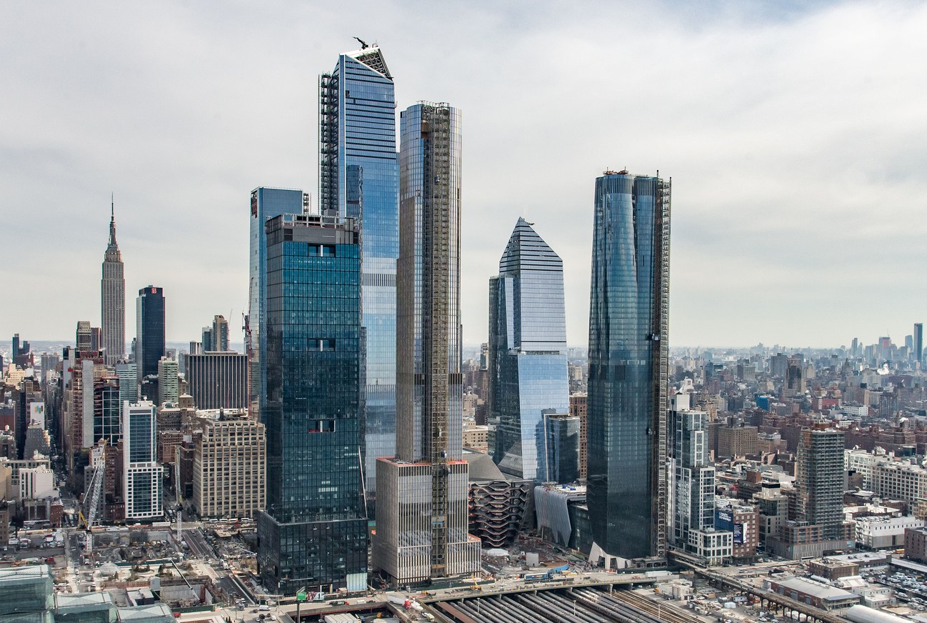
There have been a number of articles about the new Hudson Yards project in New York: Michael Kimmelman in the New York Times, Michael J. Lewis in the Wall Street Journal, Alexandra Schwartz in the New Yorker. Schwartz is forthright: “what Hudson Yards really feels like is a nice airport terminal, with the High Line as its moving walkway.” Lewis likes the observation deck of the tallest skyscraper. Kimmelman doesn’t say much about the architecture but like Lewis he points out the paucity of urban design in the master plan, and both compare it unfavorably to Rockefeller Center. Fred Bernstein in Metropolis has some interesting views on why this might be so. But none of the critics talks about how downright ugly this assemblage of high-rise buildings is on the city’s skyline. (Is that why they generally avoid mentioning the individual architects? They are: Numbers 10 & 30, KPF; 15, Diller Scofidio + Renfro; 35, SOM; 50, Foster + Partners; 55, KPF and Roche Dinkeloo.) The buildings are all-glass, of course. Some of the buildings are odd-shaped, some are rectangular, some tops are flat, some are angular, but the whole thing adds up to—well, nothing, really. These buildings are like a group of self-engrossed millennials, posturing, taking selfies, ignoring each other and their surroundings. Poor New York.


The millennial simile was brilliant. I looked again at the photo and yes, there it was.