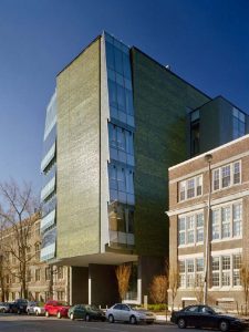
There has been much excitement in the Twittersphere concerning the appointment of Tod Williams Billie Tsien Architects to design the Obama presidential library. A no-drama president has picked no-drama architects is the gist of it. No drama? Putting an 8-story blank wall on 53rd Street, as they did in the American Folk Art Museum is nothing if not dramatic. So is designing a skylight in the form of a glass box, then theatrically cantilevering it out at each end, as they did in the new Barnes Foundation. A less well known building, Skirkanich Hall at the University of Pennsylvania presents a half-blank brick wall to the street, and in case you miss it, the shiny glazed brick is green, unlike every other brick building on that campus. Skirkanich stands out in other ways; to further call attention to itself it breaks the building line of the street, like a pushy person in a queue. The neighboring Moore School Building (on the right in the photo), which was altered by Paul Cret in 1926, is much more urbanistically circumspect—and much lower key architecturally, after all, its just a workaday engineering teaching building, not a monument. But TWBTA tends to make a fuss when they build, whether it’s a facade or a simple bench. “Look at me, I’ve been designed” seems to be the message. Implicitly this privileges the person doing the designing. But this is exactly not what a presidential library needs; its subject should take center stage.
