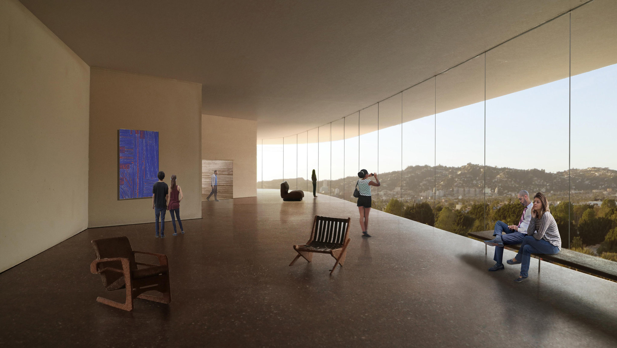
I have written crtically in Zócalo of LACMA’s decision to demolish its old museum. “Why does Los Angeles, which has little enough history, feel the need to keep reinventing its surroundings?” I asked. That was almost five years ago. Now we read that the LA county board of supervisors has finally given its approval and the new building will go ahead. I am not a fan of Peter Zumthor’s design. Apart from its rather simple-minded concept it does not look like it will be a sympathetic place to look at art. LACMA has not released any plans, but the views of the interior give the impression of an office lobby where the art is simply background wallpaper. Surely after Mies van der Rohe’s disastrous National Gallery in Berlin, we have learned that a glass-walled room is not a good setting for art? The rationale seems to be that old chestnut, flexibility. LACMA director Michael Govan is quoted by the New York Times as saying that the new museum will create spaces that are “good for different kinds of art.” Looking at the slow evolution of Zumthor’s design, now black now white, now blobby now zigzaggy, I am reminded of a comment that the landscape architect Laurie Olin made to me during an interview about Apple Park, Apple’s new HQ in Cupertino. “There are some architecture firms that could do a project of this size but not as refined, and there are firms that could produce as refined a design but could not handle the scale, but there are very few firms in the world that can do both.” Zumthor’s firm is not one of them.

