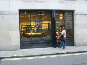
It’s exactly twenty years since Venturi Scott Brown completed the Sainsbury Wing of the National Gallery in London. After visiting the museum last weekend, I am still impressed. The sheen of newness is gone now, and the architects’ intentions are all the more visible: to make an addition that continues the 1830s building, and is also itself. Venturi explains that the rhythm of the pilasters on the façade is meant to be a jazzy riff on Wilkins’s staid minuet. The sometimes arch mannerist gestures seem a little tired, but the resolute attention to detail and construction (so rare today) remains affecting, as it is for any good building. The galleries are excellent, and the quality of the light and viewing experience seems to me equal to the best Kahn museum—the Center for British Art at Yale. But I enjoy the exterior of the Sainsbury Wing more. Walking around the building, one can admire the brickwork patterns at the back, and the polychrome neoVictorian columns that pop-up along Whitcomb Street (below). This is clearly a building designed by two architects at the top of their form. Sadly, it remains a unique masterwork in Venturi’s late oeuvre. There should have been many more such opportunities.
On Culture and Architecture

