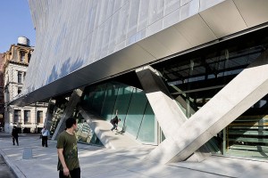
 Nicolai Ouroussoff called the Cooper Union Building “a bold architectural statement of genuine civic value.” Paul Goldberger described it as “the most exciting, energetic, and well-composed academic building to go up in the city in at least a decade.” James Russell was only slightly more circumspect: “Mayne’s high-wire act may offer an important lesson in creativity for Cooper’s students.” How could so many New Yorkers be taken in? I thought to myself as I looked across Cooper Square at the building. The photographs I had seen did make the building appear bold and exciting. The impression in real life was very different. The design struck me as a willful exercise in architectural nihilism. Everything you thought you knew about architecture is wrong. Columns should be vertical–wrong. Walls should be straight–wrong. God is in the details–wrong. The context is important–wrong. Buildings should represent some sort of order–wrong. Writing in Slate about the U.S. Federal Building in San Francisco, I once described Mayne as a Mannerist, as much so as Venturi, although Mayne’s vocabulary was industrial rather than historicist. But Cooper Union ventures into darker, dystopic territory. I found this shabby, crabbed design intensely upsetting–and not in a good way. “Thank goodness for the trees,” my wife said.
On Culture and Architecture

I looked up Cooper Union on Google Images. The building seemed a bit tipsy and incoherent. Maybe if I actually stood under it, it would look more persuasive.
This building looks much better in photos than in actuality.
“This building looks much better in photos than in actuality.”
Isn’t that what most starchitects design for – for the magazine and web photo?
That’s a shame. I was hoping that the maxim – the difference between looking at an architecture through a photograph and at the site is like the difference between sex and phone sex – was true for this place, because I was planning on visiting Cooper Union one day.
exactly right
It looks pretty bad in photographs too.
FWIW, I live nearby and I’ve attended a couple of events in the building. It’s a disgrace in every possible way. Cooper Square/ Astor Place used to have a nice feeling to it. Now it’s starting to look like an architectural junkyard.
Question Du Jour: Why are schools sponsoring so much of the country’s worst, most show-offy and intrusive architecture?
Here’s a bit a co-blogger did on Mayne’s CalTrans building.
http://uncouthreflections.wordpress.com/2013/01/07/thom-mayne-must-be-stopped/
Because “critics” like Ouroussoff and Goldberger can tel good or bad. They only look for the strange and unexpected so they can claim they dicovered the new Starchitect. And thats why we have so many bad Starchitects.
Hmm. Wouldn’t you say that, although you found the display of this architecture upsetting, this design by Thom Mayne fits with the way Cooper Union students dress? Largely eclectic and hipster. If anything, I feel that it’s similar to Neues Staatsgalerie by James Stirling in that aspect. Although, however, I’ve only seen both buildings through photographs.
Also, I might even dare to agree with James Russell and say that the “nihilism” shown in the design’s column placements, wall curves, and etc. is definitely a creativity lesson for the students who was admitted to the school through their original “hometest” answers.
I agree that the building is a fitting setting for contemporary eclectic dress. But then I’ve never liked the idea of wearing your baseball cap backwards, either.