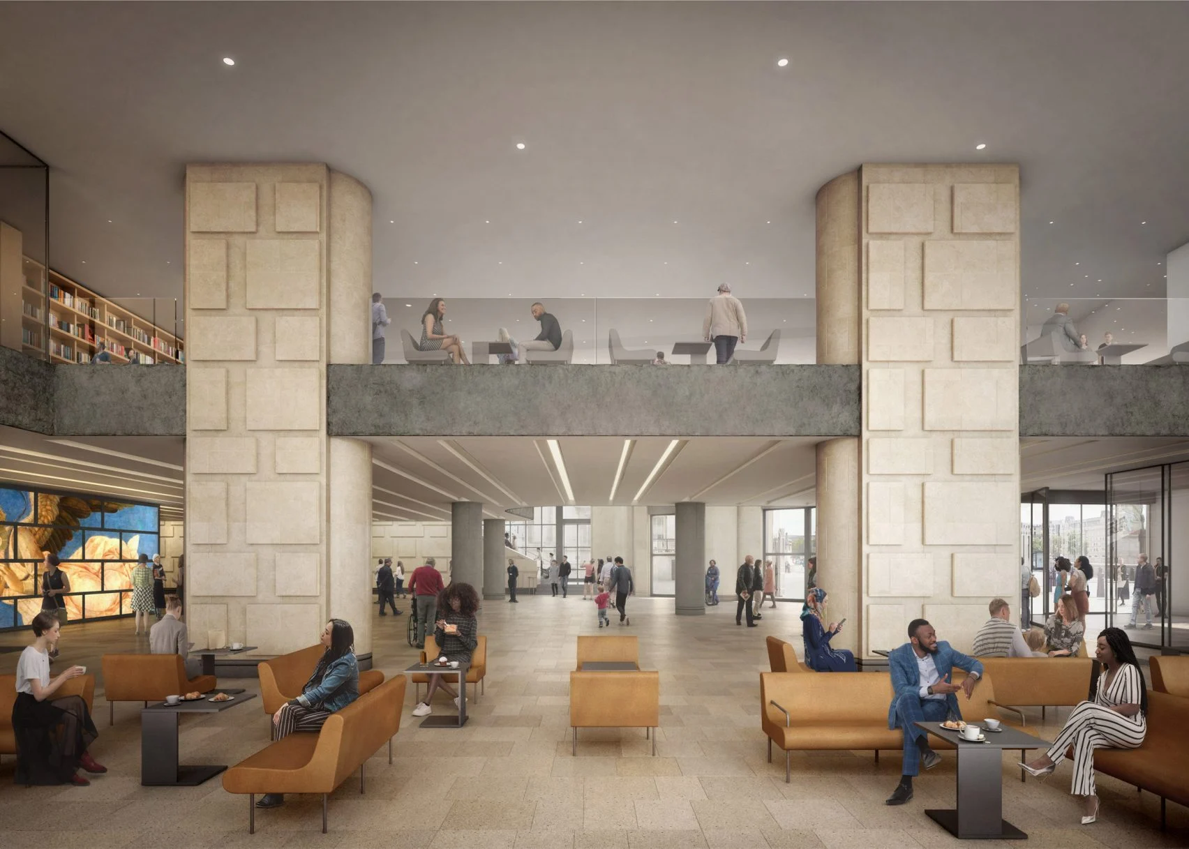
The Sainsbury Wing of London’s National Gallery is an example of postmodernism, a style that was already in decline when Robert Venturi and Denise Scott Brown won a controversial competition to build this addition. In the eyes of many, including this writer, the Sainsbury Wing, like James Stirling’s Neue Staatsgalerie in Stuttgart, is one of the (rare?) paragons of postmodernism. So it was with dismay that I read the headline in Dezeen: “Sainsbury Wing Revamp Approved.” Revamp? Although the Sainsbury Wing is a Grade I-listed building, it apparently needs freshening up. The freshening up includes removing some of the non-structural columns in the lobby as well as carving a large Trump-like sign into the Portland stone facade. The chief motivation for the alterations is the dubious decision to convert the Sainsbury Wing into the main entrance to the Gallery. The lobby rendering released by Selldorf Architects shows a rather banal space that reminds me of an airport lounge, with none of the quirky brilliance that characterized the Venturi Scott Brown design. The British architecture critic Hugh Pearman told Dezeen that the proposed alterations “would be damagingly destructive—sterilizing the original architectural character of the building.” What a shame.

