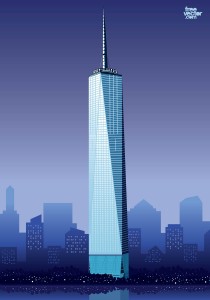
 There are many problems with 1, World Center, its brutal and uninspiring silhouette, the rather bland curtain wall (that of 7, World Trade Center, by the same architects (SOM), is much better), its weak-kneed mast. But what scuttles it as a skyscraper is the chamfered geometry of its form. It leads the eye up and down at the same time. Towers should soar; in this one, the upward thrust of one facade is cancelled out by the downward thrust of the next. As a result it looks like an object, rather than a spire.
On Culture and Architecture

Sometimes the simplest explanations are the best.
Interesting comment on 1 World Trade Center. I had always thought that it would have been better if the base was square and the tower transitioned to an octagonal top rather than another square at 45 degrees. Perhaps this would have corrected the up and down motion of the eye as you point out.